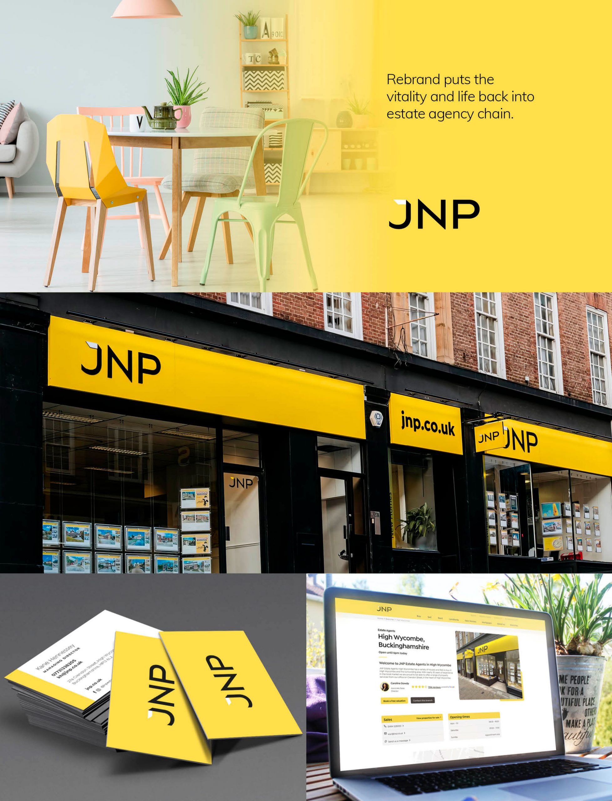


JNP asked us to look at their old fashioned logo and give it a facelift. We realised they could do more.
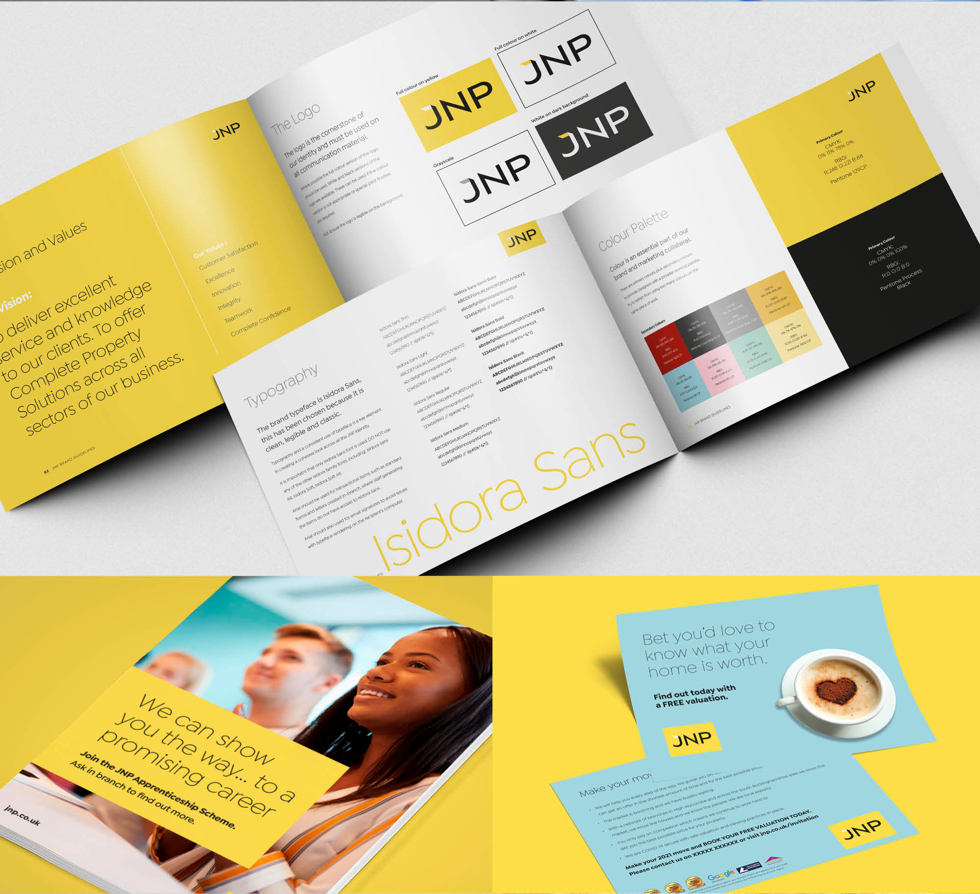
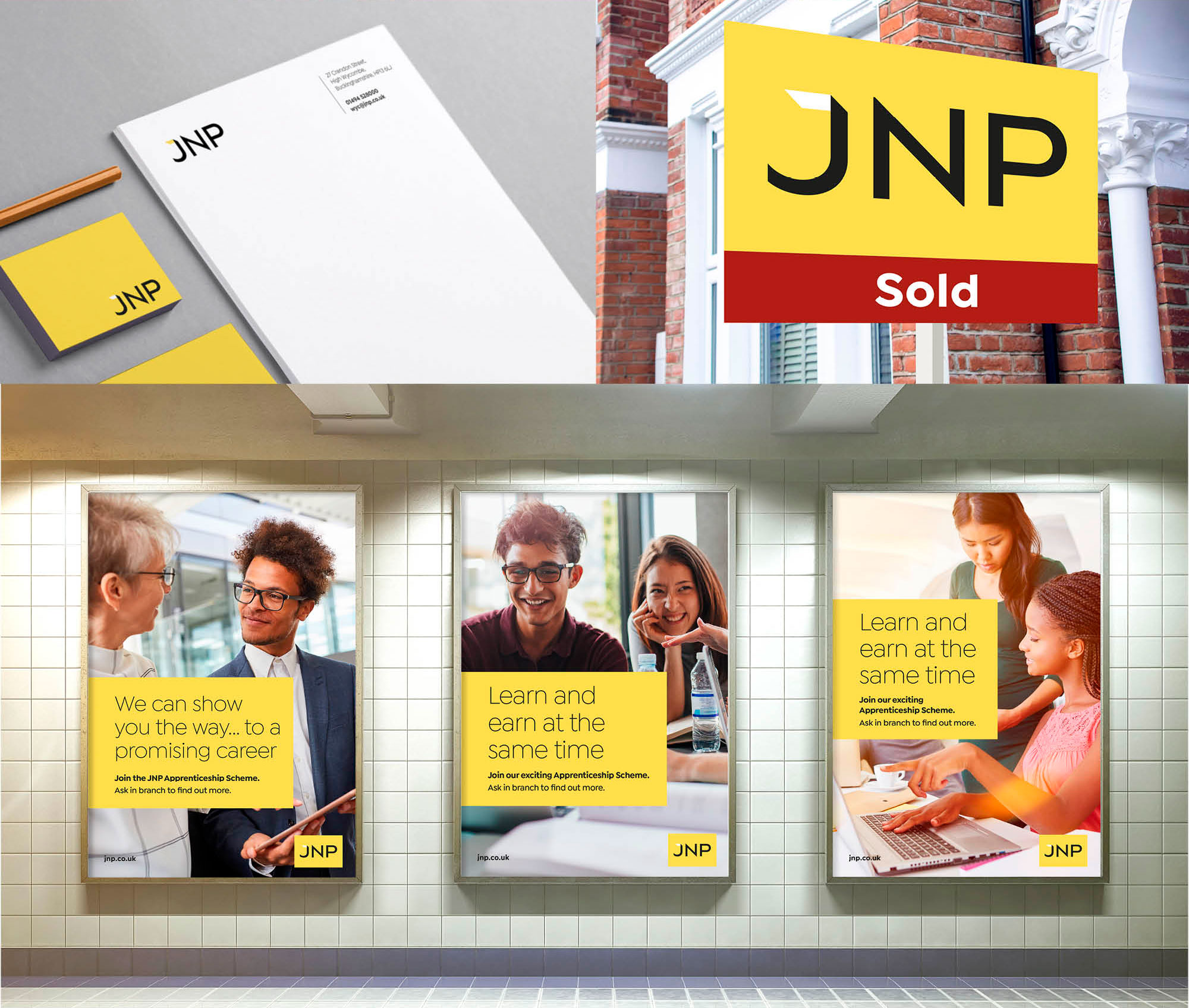
It involved a top down review of all marketing collateral in branch, on the street and online. The opportunity was there to relaunch with a completely overhauled brand by updating the core building blocks – logo, colour, typography, imagery and framework. Within months a new look had evolved, was approved by focus groups and was ready to be rolled out across all JNP collateral – modern, fresh and confident. Their signature yellow had been softened and was now teamed with plenty of white and a palette of warm greys. A new logo represented their modern uncluttered business approach. Add in a serous helping of modern lifestyle photography and new marketing material with clear direct messaging and they were ready to regain their place in the local property market.
